Payment account onboarding
About
Context: Prior to this redesign, the experience for setting up an account was different from app (Facebook vs. Instagram) to platform (iOS, Android, web). Users weren’t always aware they were creating an account, and had to finish all of onboarding to start monetizing.
Goal: Make it easier for people to onboard (set up their payment account) to monetization tools across Meta.
Strategy
Overhaul UX for onboarding. Allow users to defer or temporarily skip most of account setup. Designed scalable pattern to add additional required tasks.
Impact:
Deferred onboarding increased amount users earn by ~20%
Refresh resulted in a 10% relative improvement in users with complete payment accounts and 40% reduction in overall error rate
Services
Information architecture, content design, microcopy, privacy and compliance, localization
Created a clear, consistent experience
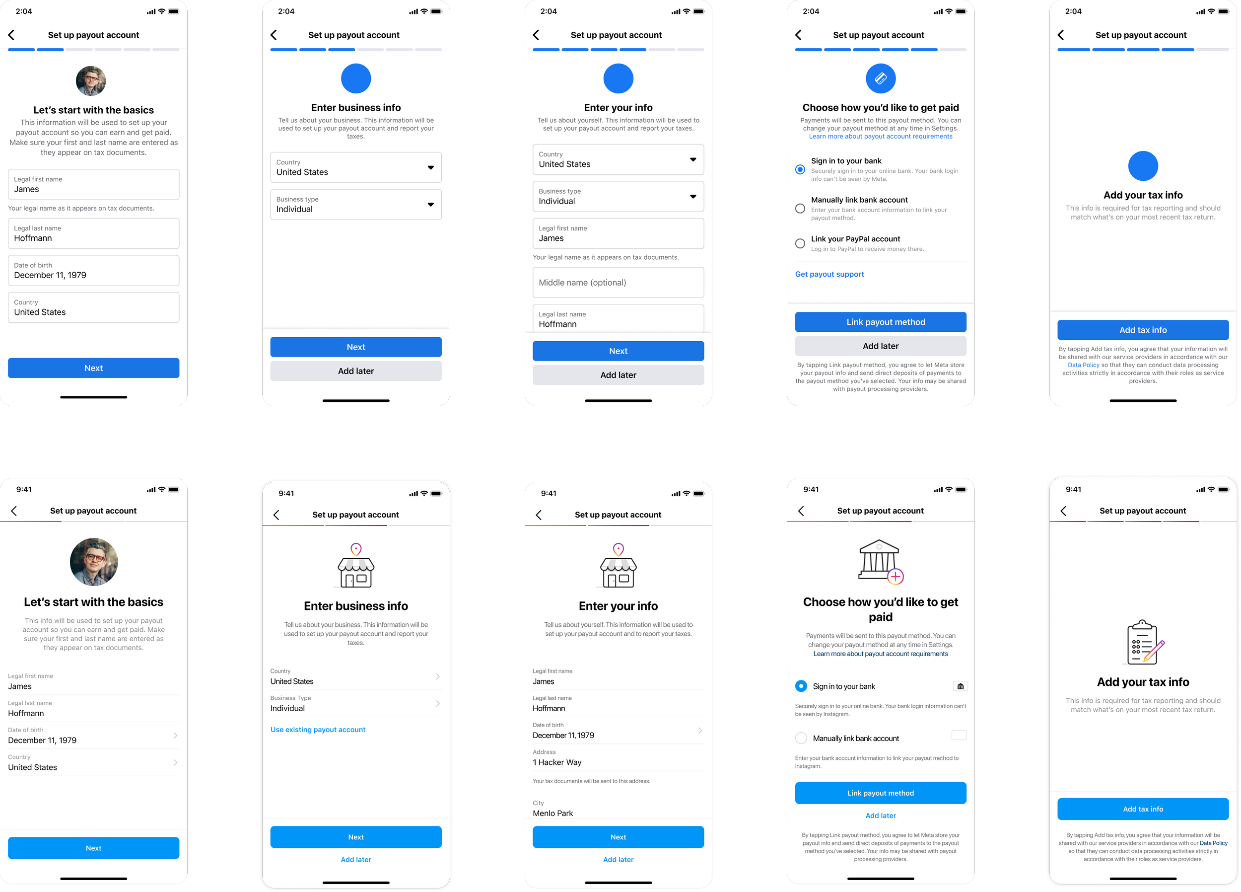
Aligned Facebook and Instagram onboarding experiences for mobile and web using their respective design systems
Developed and documented new patterns, standards, and terminology
Addressed a top user (and care team) pain point by partnering with help center and customer care teams to add education and support content
Added clarity and transparency
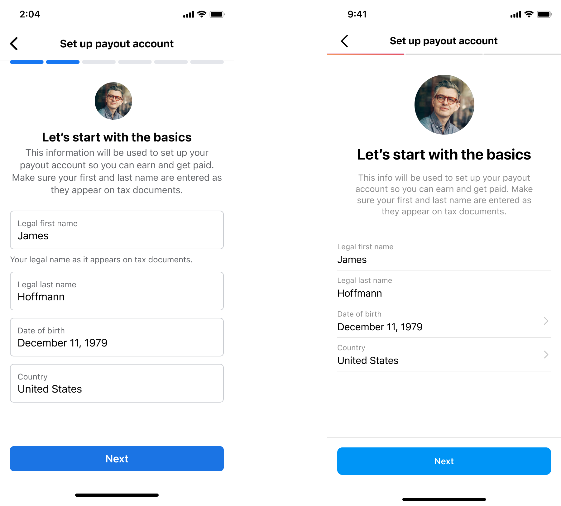
Introduce “payout account” to this flow, including retitling as “Set up payout account”
Add stepper to help users understand where they are in process
Be clear about what the info a user enters will be used for
Provide a tangible point of reference for the accuracy of info needed (“appear on tax documents”)
Introduced deferred onboarding
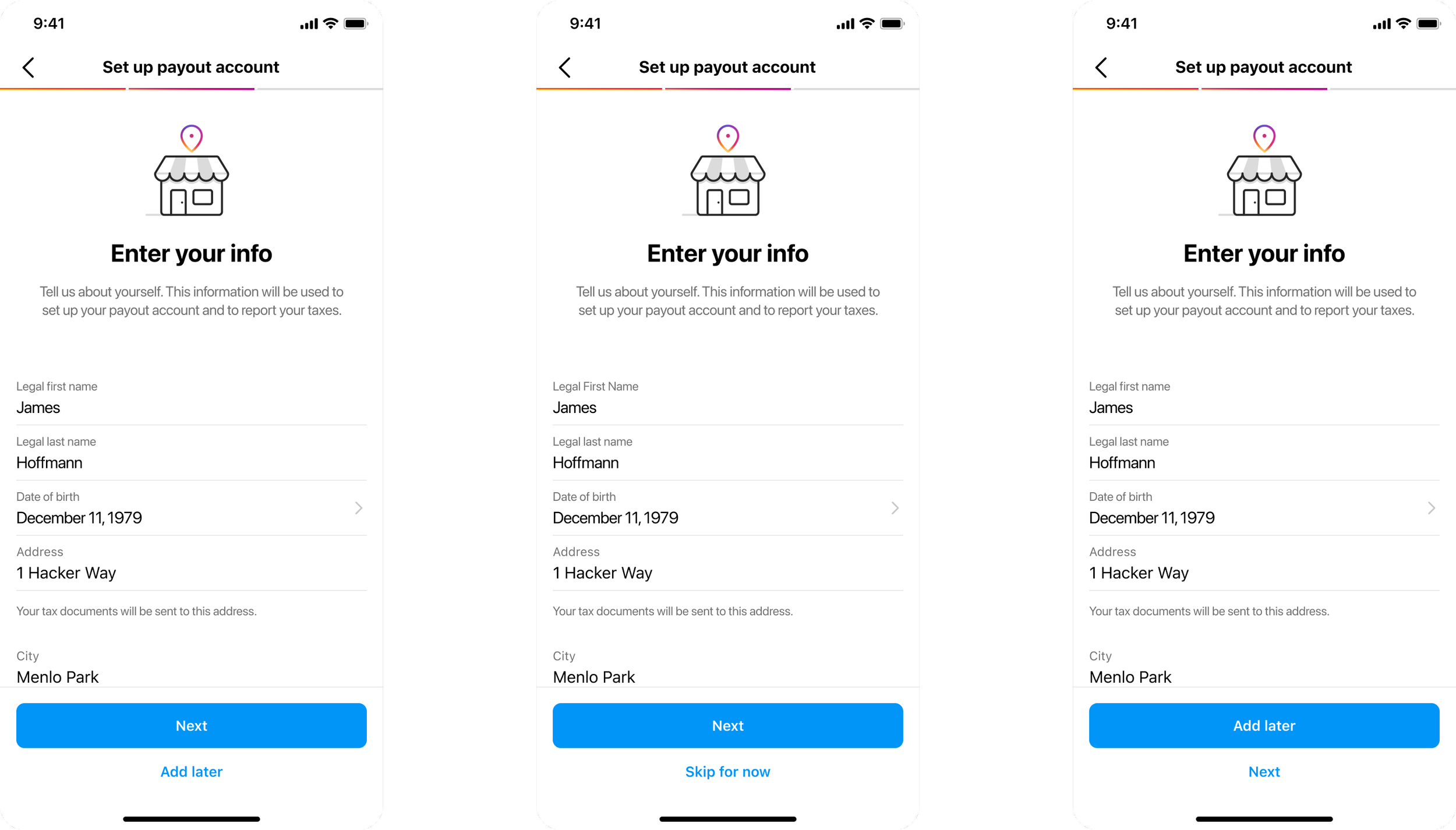
Allowed users to add the minimal information to create their account and get started monetizing
Added a secondary CTA and A/B tested secondary CTA options “Skip for now” vs “Add later”
Designed new pattern to incorporate additional tasks
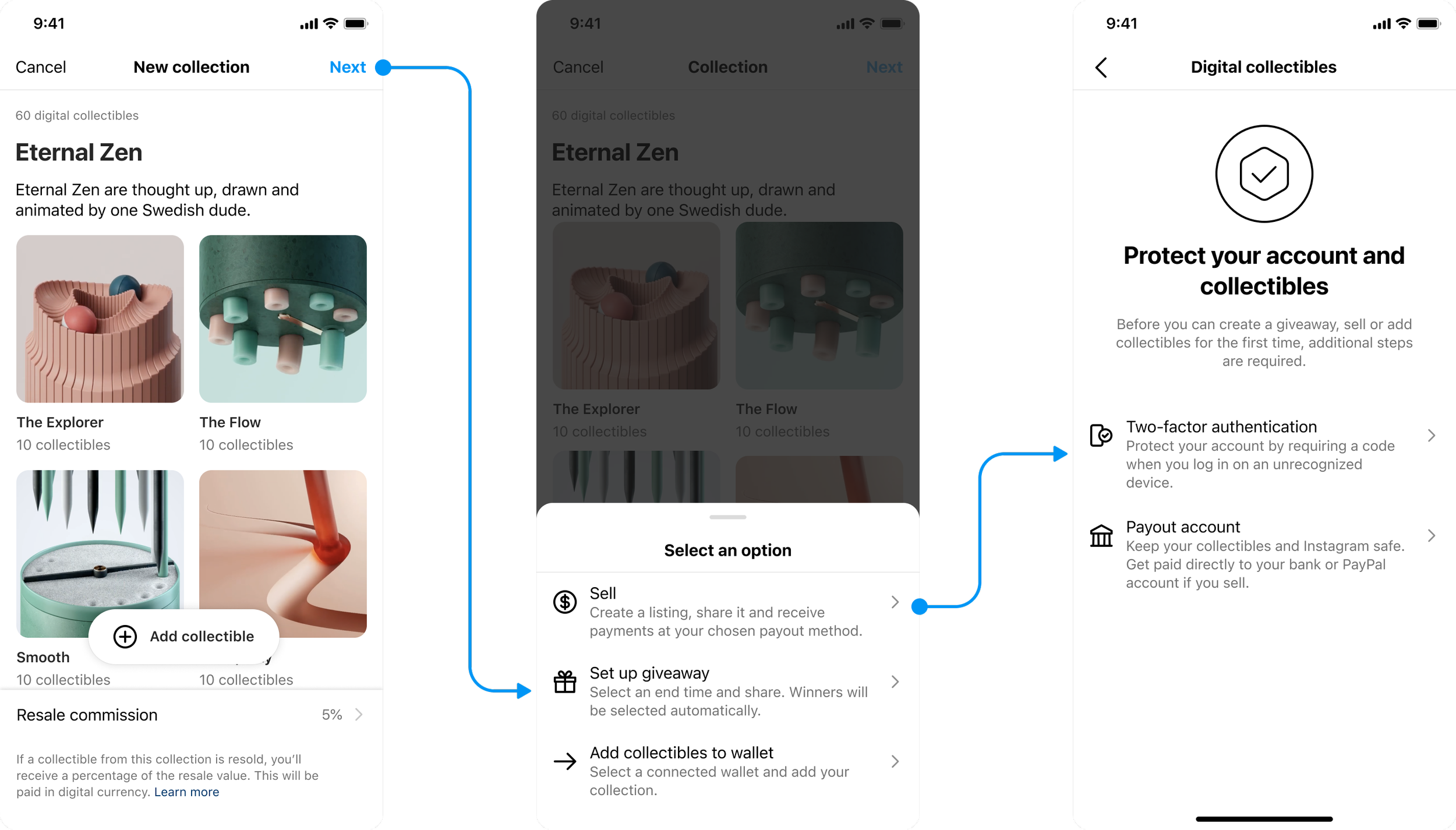
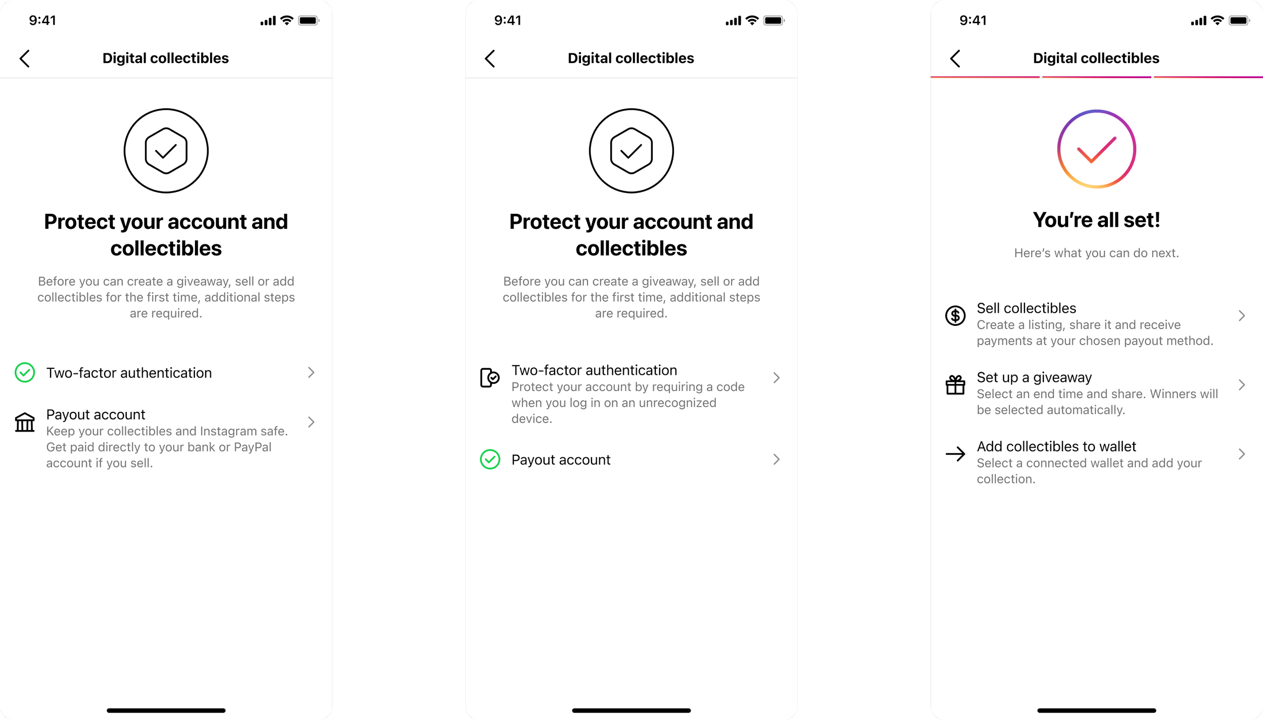
Developed solution for users to add extra security when setting up digital collectibles (NFTs)
Leveraging the IG design system, I came up a checklist screen that could scale to add other actions (like 2-factor) that are required in addition to the default (payout account)
Success icon and color confirm step completion
Steps can be completed in any order, so checklist screen was only shown if any steps were pending
Users saw confirmation screen once all steps were completed